Welcome to the first installment of a running series we will publish here at Riskcuit called “Where’s The Edge?”.
In this series, we look at popular trading systems or strategies from Gurus, forums, books, and other places around the web to determine if they actually provide retail forex traders with any kind of edge.
To do this, we will back-test the results using the entry and exit methods described in the system to see if they work right out of the box.
We will backtest/evaluate the system using the method described here.
This means we will use entry and exit signals to create our distribution of x.
Next, we will multiply each value of x by the probability of observing x. And lastly, we will sum the result of each step to calculate our expected value in pips for any trade.
This provides the expected value in pips for each trade taken using the system.
Something to keep in mind here is, a lot of these strategy authors intentionally leave out exact entry and exit rules so they can place the blame somewhere else if someone has a bad time using their system. Because of this, we will derive the entry and exit rules from all available information, to the best of our ability.
We will test all of these signals on all 28 major/minor currency pairs and crosses. Additionally, we will test the following time frames:
- 1 Minute Chart
- 5 Minute Chart
- 15 Minute Chart
- 30 Minute Chart
- 60 Minute Chart
- 4 Hour Chart
- Daily Chart
We will use a minimum sample size of 15,000 candles for each pair.
The System In Question: The Golden (or Death) Cross
If you have read any of the most famous trading books, one of the first strategies you were most likely introduced to, is the idea of The Golden Cross, also sometimes referred to as The Death Cross.
It is a simple strategy that uses only 2 Moving Average indicators to create buy and sell signals.
The golden cross occurs when a short-term moving average crosses over a major long-term moving average to the upside and is interpreted by analysts and traders as signaling a definitive upward turn in a market.
In almost every description of this strategy, the short-term moving average uses a period of 50 and the long-term moving average uses a period of 200.
Knowing this we can define our entries below:
- Long: A long is opened on the close of the candle that causes the short-term moving average to cross above the long-term one.
- Short: A short is opened on the close of the candle which causes the short-term moving average to cross below the long-term one.
Our exit signals will be:
- Long: A long is closed when the 50 MA crosses back below the 200 MA.
- Short: A short is closed when the 50 MA crosses back above the 200 MA.
With that being, let’s dig into the data below:
What you see is a table/heatmap where there is a row for each pair tested. Additionally, there is a column for each time frame tested.
The values in each column are the expected value in pips per trade for each time frame.
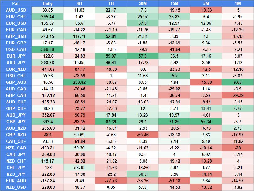
The first thing that should clearly jump out at you is how the results for each timeframe are all over the place.
We can see on the daily timeframe that some results have very large expected pips per trade, but that is because there are very few samples to go off of.
This kind of system will reduce a massive timeframe into just a few trades. For example, on the daily chart, we are looking at 15000 candles, which equates to about 15 years of trading data. With these entry and exit signals, this would produce around 8-20 trades for the entire period because each trade lasts so long and it takes a long time for a new signal to be generated.
So even though we are using over 15,000 candles in each test, we actually are not able to get that many signals per pair on each timeframe.
As a result, this produces very randomized results, which is why we see some performing very well, and others performing very poorly, with no clear trend.
The second thing to notice is, the larger timeframes produce much higher expected values than the smaller ones. This is simply the result of there being more volatility on high timeframes than on lower ones.
Even though this data is limited in terms of # of signals we can test with, there are a couple of pairs that stand out. For example, USD/JPY, GBP/USD, and GBP/JPY all appear to perform pretty well across the board with this signal as only 1 or 2 time-frames for each pair produce a negative expected value.
As a result, if you were going to trade these signals as is, you would have the best chance of success using one of those 3 pairs.
Let’s Modify It
If you have read our other post here, you should be aware that the edge in almost every pair is in the fact that price is fat-tailed, meaning it has excess kurtosis.
We also detail in that post how you need to structure your trades so take advantage of this kurtosis, specifically by setting up your signals so that you let your winners run and you cut your losers short.
Let’s modify our exit signals to do this and see how it changes our result.
For the sake of the blog post, we are going to keep it very simple. Our exits will now be:
- Long: We will close a long trader after 120 candles have passed since our entry OR if a candle has closed below our fast MA (50).
- Short: We will close a short trade after 120 candles have passed since our entry OR if a candle has closed above our fast MA (50).
We will also modify our entry signal so that we can get more trades out of the distribution. Instead of opening a position when the MAs cross, we will use the much broader entry signals below:
- Long: The fast MA (50) is above the slow MA(200) and a candle has closed above the fast MA (50).
- Short: The fast MA (50) is below the slow MA(200) and a candle has closed below the fast MA (50).
This will allow us to take a lot more trades in each test, which will provide a clearer estimate of the expected pip value of each trade.
With these changes, our heatmap now looks like this:
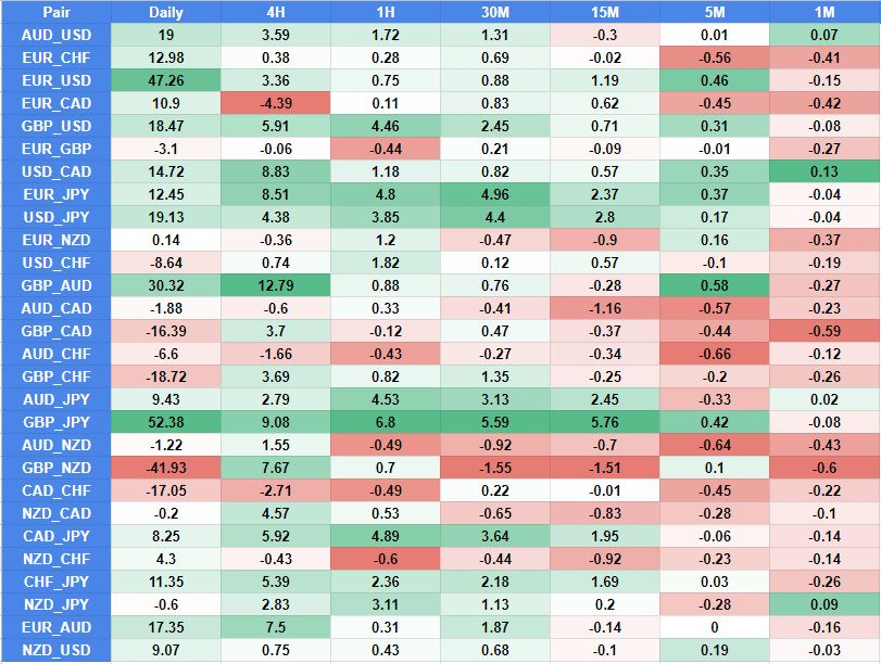
Look at the difference that made. By modifying our entry rules to try and take advantage of where nearly every edge in a price distribution lies, we are able to drastically increase the number of pairs and time frames this system would work on.
You will notice that the expected values are much smaller than previously, and that is because the trade opportunities are much more frequent. But you can quickly that these rules would actually work pretty well on quite a few pairs and multiple timeframes within each pair.
If you were to look at the kurtosis of each pair/time frame, you would also notice that the pairs with the higher kurtosis values, work better than those with the lower ones.
Conclusion
There you have it folks, a solid look at where the edge lies with the Golden Cross trading system.
When we used the original signals, we could see that there were not many pairs or time frames that worked well, and of the ones that did, the number of trades produced in the sample was very small.
By modifying our entry and exit signals so we can take advantage of where the edges are present in a pair’s price distribution, we are able to drastically increase the results of many pairs and time frames. Additionally, because our modified entries and exits produce more trading opportunities, we are able to rely on these results more since our samples are much larger.
I would encourage you to re-read this post multiple times to better understand why our signal modifications worked.